UK Screen Alliance talks with MD and Colourist Toby Tomkins about Blackmagic Design continuing its expansion of DaVinci Resolve Studio at CHEAT studios, and the integral part it played in putting the finishing touches to the romantically nihilistic ‘The End of the F***ing World’.
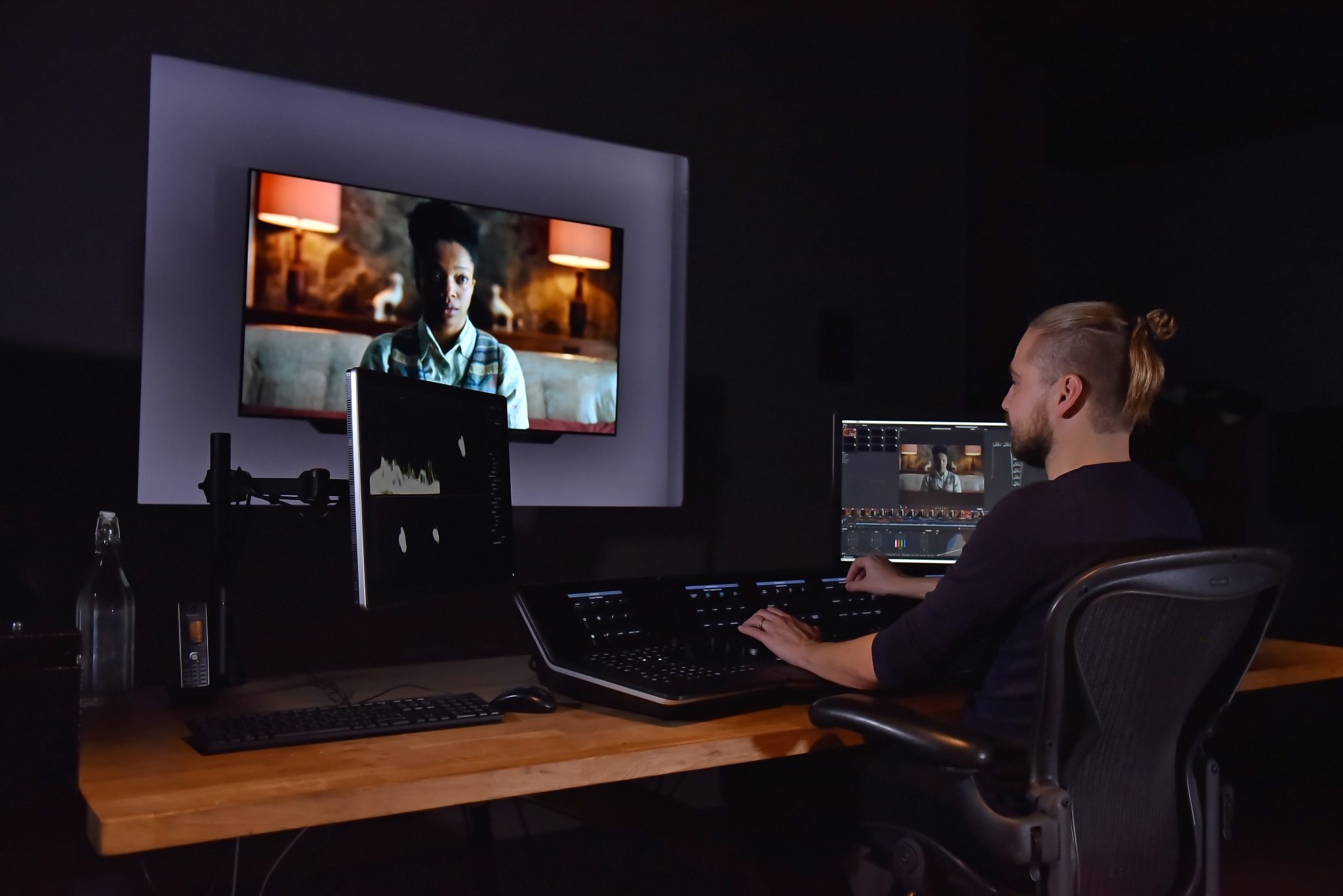
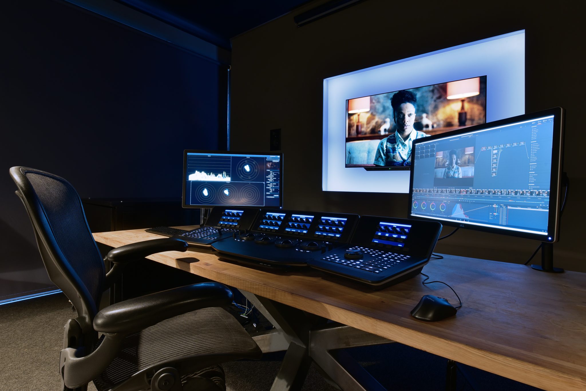
As season two of the show airs on Channel 4 in the UK from the beginning of November, we delve behind the scenes to find out how DaVinci Resolve Studio was integral to completing show adaptation of Charles Forsman’s graphic novel, in the CHEAT post production studios’ newly kitted-out HDR-ready grading suite and research and development lab by Blackmagic Design.
In this feature UK Screen Alliance interviews Toby Tomkins, MD and Colourist at CHEAT, about the process:
Did being familiar with the show after having graded the 1st season have an impact on your timeline for the 2nd season?
For season two we had 16 days to do 8 episodes, including the SDR trim and Dolby vision delivery. 1.5 days of grading plus a trim per episode. For us, it was a challenge as season two introduced a new director, new DOPs and new production designer so we wanted to ensure we could deliver to the same standards that they were expecting. I really wanted to make sure that with a different team on board that I could deliver what was expected, and it was expected that it would look like season one. And that was quite a lot of pressure for us.
What was the process like when it came to HDR delivery?
Well, the exciting thing about season two was that it was my first HDR Dolby Vision Grade! We decided to use HDR very sparingly on the show, only using an additional stop, maybe two stops of highlight range. All the diffuse highlights were below 100 nits. We really only used the extended range for specular highlights and to get a little bit more texture in things like practical lamps, the sun, clouds, things that traditionally would have been compressed on the shoulder of the SDR grade, using just that extra stop maybe two stops in that in the HDR range, to have a little bit more texture in those highlights.
We didn’t want to go too HDR-y, we were worried it wouldn’t stay true to season one. We found a nice middle ground in using the HDR to increase the texture on the top end, while staying true to the film-y soft shoulder roll off of the SDR grade of season one.
And even though it’s subtle, it’s really sort of liberating for me as a colourist, to be able to have shape in the mid tones and also shape in the highlights because normally you have to compromise one or the other to have a natural image. By grading in Dolby Vision, we’ve we stayed true to season one in terms of the look and the world and what we’d previously created.
There are other shows on Netflix like Chef’s table that use HDR sparingly, while on the other end of the spectrum Sci-fi shows like Altered Carbon have a really interesting use of HDR that fully-realises the sort of extended highlight saturation you could take advantage of and push the boundaries in terms of how any show could look in HDR. HDR is a new thing, and I think the important thing about it is to have the creative freedom to use it in the way that’s best for the project.
You mentioned staying true to that ‘filmic look’ from season one, can you tell us more?
Well the thing about filmic is that everything was printed to film until not too long ago, so it really informs our visual language for what looks filmic and cinematic. A big part of that is a very soft highlight compression, or roll off, or shoulder – there are several names for that – which is the way the highlights compress on the print so that you can have good colour contrast in the mid tones, which is where you know faces are.
Faces are where you’re traditionally looking, so you must always compromise the sort of highlight latitude and shadow detail. Making something filmmaking cinematic and HDR is walking a very narrow line, and I think we’ve managed to get right under the hood in this grade with Resolve.
How did DaVinci Resolve help you with this?
We wanted to ensure that with the HDR master, unless there were bright things in frame, looked identical to the SDR. We made sure that anything that didn’t need HDR didn’t use it, and anything lit with soft light for example looked the same in HDR and SDR.
The software CMU in Resolve was a huge lifesaver as it meant I could monitor the HDR and SDR simultaneously. Without that, it would have been a lot more expensive and a lot harder to do what I wanted: to monitor dual output so that I could see the HDR on one screen and the SDR trim on another. Previously something like that would cost around £5000 with a hardware CMU solution, and if you wanted to do 4K I think you’d have had to buy two!
It was amazing, because if something didn’t look right on the SDR I could quickly play around with the trim controls and see if HDR grade could look good, because we wanted to make sure that the SDR wasn’t compromised at all while making the HDR version.
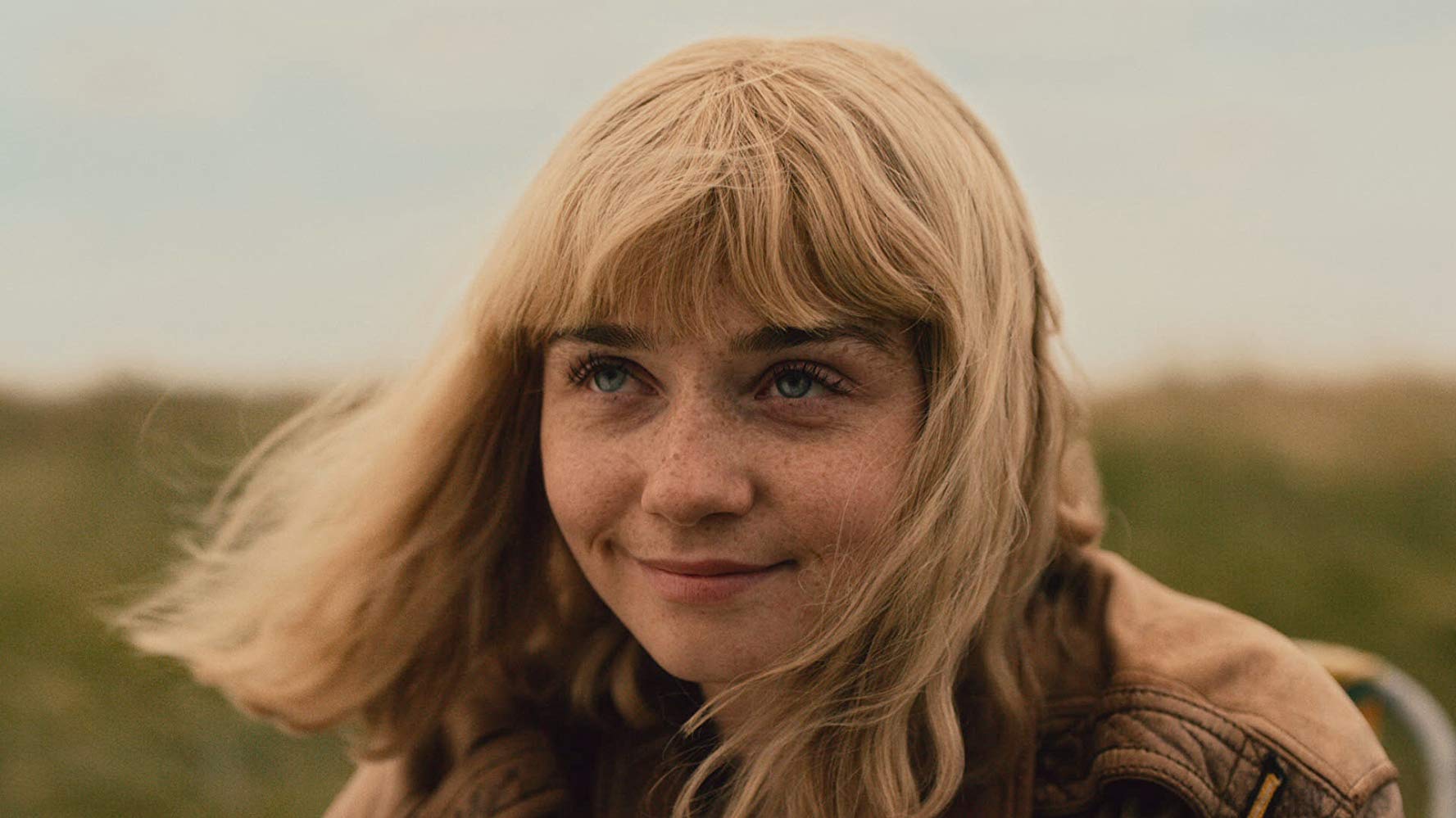
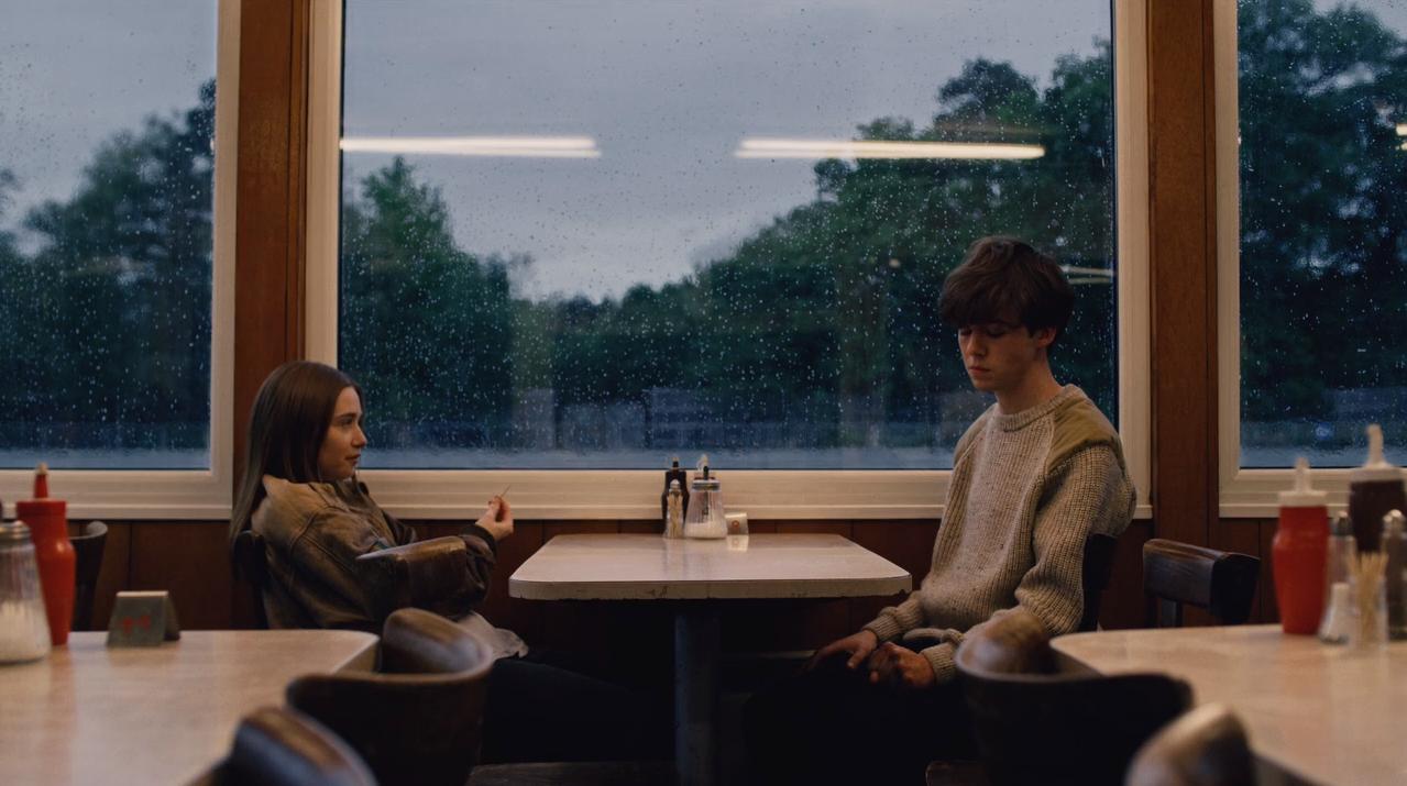
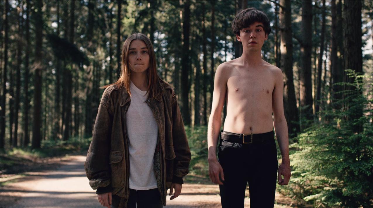
The End of the F***ing World Season 1 stills. Images source: IMDb
You developed a rich Americana look with a film-print feel, to compliment the dark narrative for the first season. Can you tell us more about the main aims for how the grade would look in season two?
We decided not to go for an Americana look for season two, because it was mostly overcast / cool light, so we tried to keep it feeling more neutral while having a filmic aesthetic that stayed true to season one. We recreated the season one world in HDR and made sure that it worked. To do this, we hired a colour scientist and a software engineer for two weeks and set up a Research and Development Lab. It’s was just them and laptops and an HDR screen to test stuff out on. And one of their primary focuses was to recreate the film emulation look up tables we used on season one. They adapted the film emulation look from season one to something that could be used in an HDR pipeline.
A good tip to do this is to look at the Blu-ray stills of films shot and printed on film, like Roger Deakin’s earlier work. You should be able to sort of replicate this look with grading tools. 90% of this look is done with grading tools, and it’s only the last 10% where we used a film emulation transform. If I toggled the film emulation transform on and off, there were changes like a slight change in density of the green and blues, and a little bit more colour separation on the warm and cool axis. But even if I turned that off, it still felt filmic. That’s because of the curve that I drew, and the green, red and blue keys that I put in the skin tone. It’s all traditional grading tools from years of looking at film and looking at digital and appreciating the differences.
From now on, any client that wants a filmic print look, but with the flexibility and extended opportunities of HDR, can come to us for a distinctive aesthetic catered to their needs. That’s crucial with our ever-increasing client demand to deliver in Dolby Vision. This look was built around this show, so it’s something I’ll probably never use again but the components I will. The show was shot so well and so consistently that honestly, even if it went out with the base look, I think people wouldn’t necessarily know that it wasn’t finished
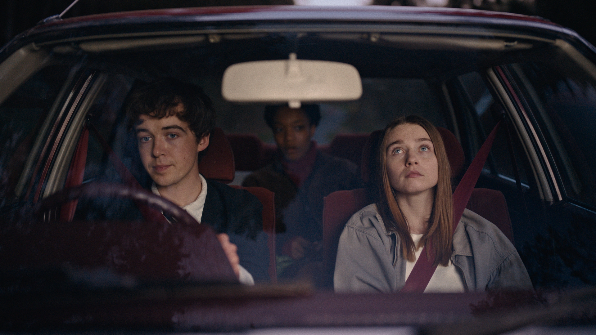
The main change for season two was that a lot of things were shot to be set in the past, and there wasn’t a lot of sunshine. It suits the narrative because especially for the first few episodes, it’s has quite a sombre feel. It’s not meant to be too sunny or west-coast American. The world is the same, but the feeling is slightly more muted.
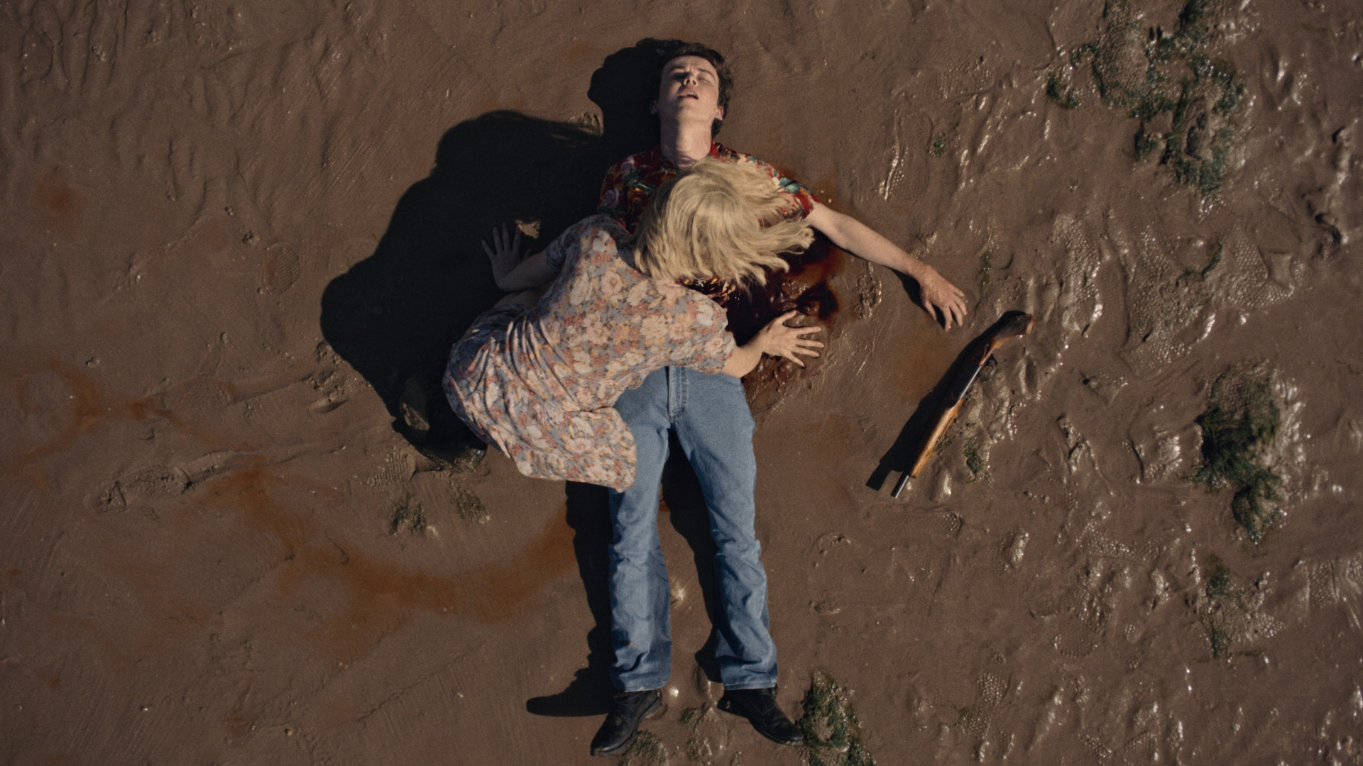
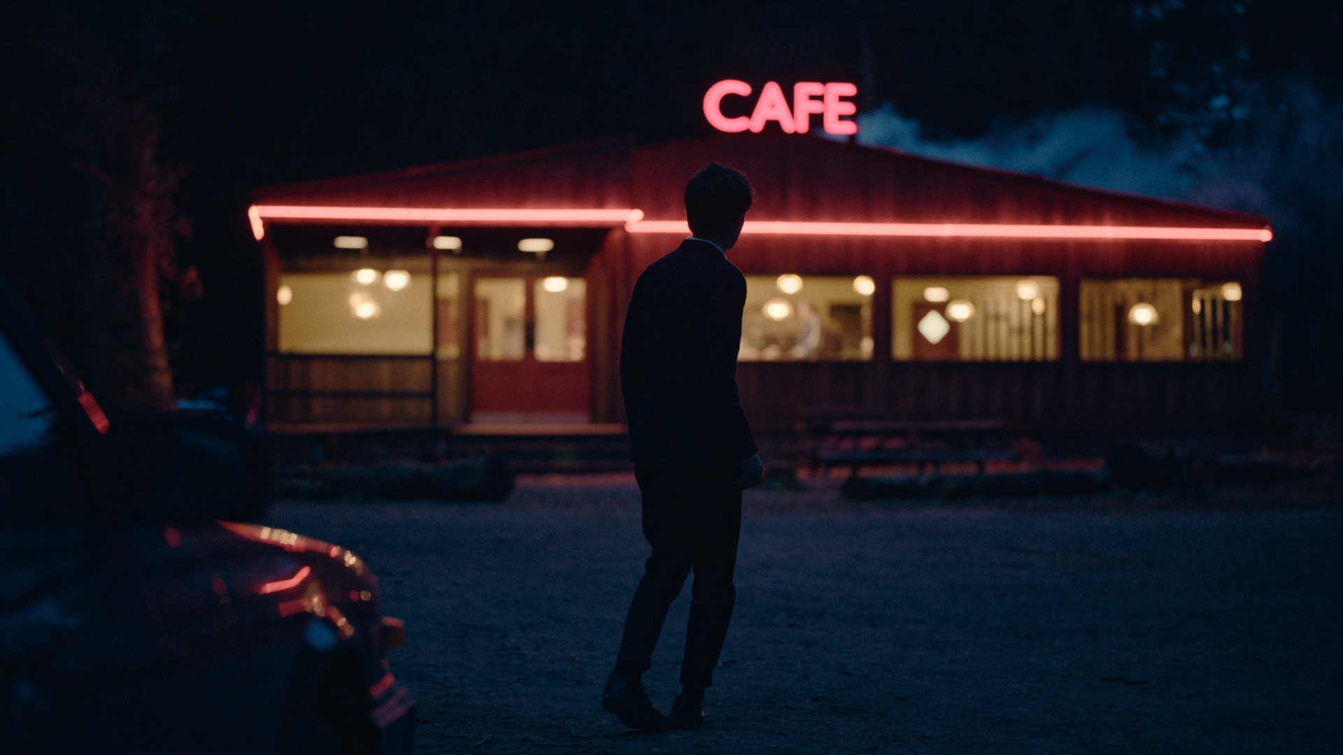
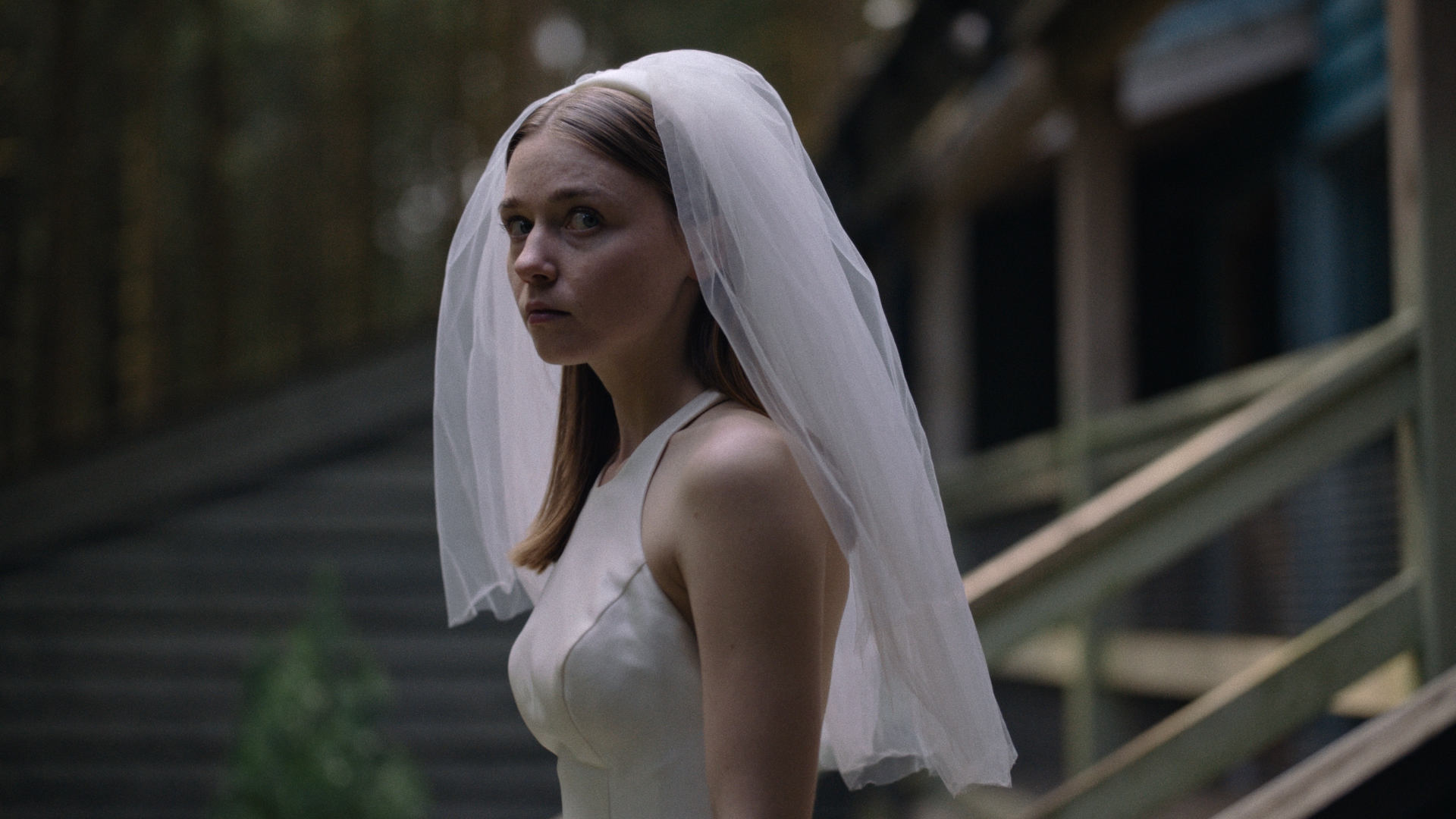
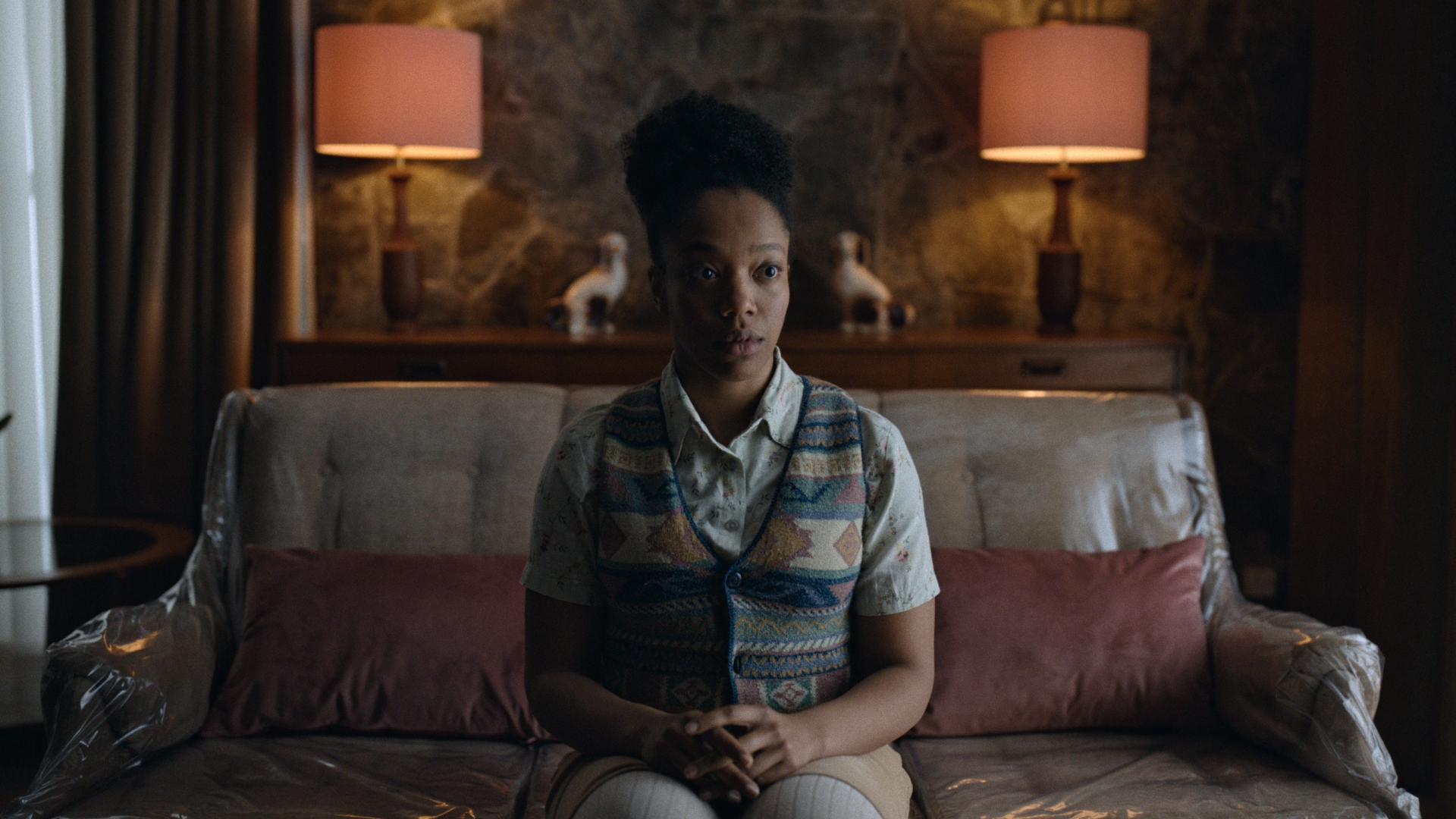
The End of the F***ing World Season 2 stills. Images source: Courtesy of CHEAT.
When it came to skin tones, were there any changes in grading for season two with the suite?
In season one, we wanted the show to have richness and a denseness to it, with skin tones having almost a leathery red tone, adding some warmth to the characters. To do this we wanted quite a dense film print look, using skin tones you would find on celluloid film and a shadow and highlight roll-off that you would find in films, as opposed to British TV.
For season two there’s a push to gold in the more neutral colours, so someone might be looking a bit pale on overcast days. There’s warmth there, and that again stems from the film emulation side of things. The white balance of film stocks traditionally goes from generally a cooler colour in the shadows, through to a warmer colour in the highlights with less colour separation. The highlights are de-saturated with a warm tint. When you’ve got white British faces in with white sky, skin tone tends get washed out, but on film, they can be a little bit of more separate. What I’m really doing is replicating on season two, putting enough warmth into those skin tones to give them that sort of rich, leathery feel.
Are there any other aspects that stand out with using DaVinci from a grading perspective?
We did some interesting colour pipeline stuff that was pretty unconventional. Traditionally, when working in HDR, your colour pipeline is what’s known as a colour managed pipeline. And traditionally, the sort of the transform from your camera source to your scene referred space, and then your display space is all handled, automatically by mathematical transforms. And that’s also something that would have been true, if we would have graded this in aces, they would have been a preset, sort of rendering transform.
But, in order to recreate the tone of season one, and to have ultimate control, I manually created my own rendering transform! This was just a curve, but it’s very hard to manually create that transform. It just took it a few days of experimenting with the material and episodes one and two, to ensure that that transform was flexible enough for all the lighting situations that we had. And to make sure that we had the same amount of shape in the SDR range, but also latitude in the HDR range. That’s a very nonstandard approach from what I know, and what I’ve heard from other colourists.
Thank you for your time Toby!
Visit Blackmagic Design’s website: www.blackmagicdesign.com
Visit CHEAT’s website: www.cheatit.co
The entire eight-part series of The End of the F***ing World Season 2 is now available to stream on All 4 and Netflix.


